I recently had to pleasure of sitting down (figuratively) with the American Institute of Graphic Arts (AIGA) to discuss my advertising career, my involvement in social groups and my Christmas tree Doug. If you have a couple minutes and want to see some creepy pics of me and my tree, give it a read! Click here to read the interview.
All I Need is Kat… and The Beatles

AIGA Jacksonville recently asked me to join 11 other members in interpreting the symbol most synonymous with love (the heart) for the 2012 I Love Design poster project. I was incredibly flattered that I was invited to participate, and the following is the write-up that I submitted with my entry: At the ripe young age of 37, I found myself a newlywed. When asked to define love in a heart-shaped box, I immediately thought of my wife. And did I mention The Beatles? I really, really love me some Beatles. If I’m not listening to them, I’m seeking out music heavily influenced by them, co-written by them or even vaguely reminiscent of them. So it seemed only fitting to combine my love for Kat with that of what I consider to be the greatest and most influential band in musical history. I give you… All I Need is Kat (and The Beatles).

Always Summer… Circa 1967

AIGA’s Always Summer poster show is a prime display of the creative excellence of Northeast Florida’s greatest design minds. The premise is simple. Design a poster of any size, in any medium, referencing a song that reminds you of summer. It’s a great exercise to brush out the cobwebs and create without limits. My entry just happened to celebrate a summer that happened before I was born. It’s of particular note to me because it’s when one of my favorite Beatles albums was released. Where I went a little different with it, though, was in how I portrayed the Fab Four: as actual peppers. To round out the food theme, the salt & pepper/fork & spoon combinations formed the shapes of Paul McCartney’s Hofner bass guitar.
Addys by Proxy? …Sweet!
I just found out that my former agency entered the Addys with some of my 2010 work and won! They were ad campaigns produced for the Catlin Arctic Survey and Catlin Product Contamination Insurance. Both were fun projects to work on, and I’m really happy to have them in my portfolio! Click on the names above to see the full campaigns.
It Came from Christmas… Card
For a conceptual thinker, I can be literally-minded at times. Last year, I was quoted as saying that what started out as a joke with my 3-foot Christmas tree “Doug” has now turned into a monster. So what better way to make that come true than with his very own feature film (or poster, at least) in the genre of 1950s sci-fi horror? For those of you familiar with downtown Jacksonville, you may notice that Kat and I are running up Continue reading “It Came from Christmas… Card”
Mitra Clothing
What do you get when you combine a talent for clothing design with a bubbly personality, an eagerness for success and a love for… eggplant purple? You get Mitra! When this client approached me to brand her clothing line, her main concern was to have a logo that looked like high-end New York fashion, but could still be clean and simple enough to embroider on clothing labels. In the initial meeting, the client stated that she wanted the look to be Continue reading “Mitra Clothing”
Old Fashion Wedding… Design

Since the venue for our wedding is the historic 5 Points Theatre, I thought it would be fun to go retro with the Save the Date cards. After borrowing from the feel of old movie posters for the front and infusing a little Hatch Show Print-inspired rock n’ roll poster for the back, this came together nicely. The eggplant, split pea and robin’s egg wedding colors (yes, those are the actual names) are offset by a slight distressing to give it that vintage feel. And now that I’ve had a chance to catch my breath… on to the invitations! Click here to see the Save the Date.
Save the Date!
Since the venue for our wedding is the historic 5 Points Theatre, I thought it would be fun to go retro with the Save the Date cards. After borrowing from the feel of old movie posters for the front and infusing a little Hatch Show Print-inspired rock n’ roll poster for the back, this came together nicely. Continue reading “Save the Date!”
Mind Jar Media
Is it wrong to give in to that initial impulse? The first place your mind goes when you hear a company name? I don’t think so. After all, with a name like Mind Jar, wouldn’t you be just a little bit disappointed if you didn’t see a brain in a glass container? You bet you would! It’s a good thing the folks over at Mind Jar agreed with me, because that was exactly my vision for it! Continue reading “Mind Jar Media”
Greater Jacksonville Fair
When I sat down with the Greater Jacksonville Fair to discuss revamping their look, I felt a little embarrassed that I couldn’t remember seeing any of their materials in the past few years. This shocked them since yearly they promote on more than 50 local billboards and distribute print materials to hundreds of area businesses. For me, the mission became clear. Make the message simple. Make the graphics bold. Make the people remember it! Continue reading “Greater Jacksonville Fair”
Imagination Squared
Imagination Squared is an initiative to show Jacksonville’s creativity and commitment to the arts in education and in life. These small squares (about 1,000) will be assembled into a giant mural to be displayed in Jacksonville’s Museum of Contemporary Art. Now I know it’s only a 5×5 inch square, but my big challenge was what to actually put in this thing. Being a music lover, my mind immediately went to my two biggest inspirations… Elvis and the Beatles. After struggling over which one to feature, the question hit me, “Why not both?” So my square shows the evolution of the career of Elvis through sketches superimposed on the Beatles’ famous Abbey Road album cover. I had fun with this, and I hope to contribute on projects like this in the future. Click here to see my square.
Imagination Squared
Imagination Squared is an initiative to show Jacksonville’s creativity and commitment to the arts in education and in life. These small squares (about 1,000) will be assembled into a giant mural to be displayed in Jacksonville’s Museum of Contemporary Art. Now I know it’s only a 5×5 inch square, but my big challenge was what to actually put in this thing. Being a music lover, my mind immediately went to my two biggest inspirations… Elvis and the Beatles. Continue reading “Imagination Squared”
JAXPORT Box


Dundee Hills
In a time when the Napa Valley more closely resembles a theme park than laid back wine country, there are other wine regions in the west that provide the authentic and tranquil Napa experience made popular in the 1970s. These double truck ads feature an illustrated coastline and map from Napa to Portland, great photography of rich Oregon wine country and cheeky call-outs such as “No busloads of tourists here,” and “No $30 tasting pours here.” Continue reading “Dundee Hills”
The Outback Croc
As part of a pitch to Outback Steakhouse, I was tasked with creating a simple crocodile character for use in web and television commercials. After inking the croc, I printed him, crumpled him, photographed him, loosely clipped him out, then placed him on a CG background. Oh yeah, I experimented… and love the finished result. Below you will find one of the earlier crocs (more Gary Larson-looking) that I explored along the way. Continue reading “The Outback Croc”
Eleets Transportation
When you’re in the whirlwind known as the RFP, sometimes it seems like there is little time for anything other than getting the package out on deadline. But then there are times when things just seem to fall into place, allowing you time to add a few finishing flourishes. On limited time and a more limited budget, I was able to concept and produce this fun RFP piece, which features a clean design, concealed wire binding, a blind embossed logo cover and a custom tab page for financials. Continue reading “Eleets Transportation”
Catlin Arctic Survey 2010
New year, new survey… new look? For the 2010 Catlin Arctic Survey, I went for a cleaner, more focused layout. The THIS IS campaign shows visuals of the scientists roughing it in the North Pole, while the headline pulls the relation back to Catlin and their dedication to insurance underwriting. This five-ad series ran in multiple business and insurance publications in the US and the UK. Continue reading “Catlin Arctic Survey 2010”
Blue Room and Company
Under the designation “Boudoir, but Better,” Blue Room and Company is a Jacksonville-based photography studio specializing in tastefully arousing portraiture captured as gifts for loved ones or for the clients themselves. This business concept reminded me of something from a different time – a century-old, evocative, behind-closed-doors act – and I wanted the logo to convey Continue reading “Blue Room and Company”
Annual Reports
Over the years, I’ve produced annual reports for clients such as the Jacksonville Urban League, Scott-McRae Group and Hubbard House. Each project presented a unique opportunity to learn about these organizations in depth and create a snap shot of how each played a roll in the community. Because the nature of Continue reading “Annual Reports”
RFPs, Making the New Business World Go ‘Round.
There’s nothing like pitching a new business to allow you to push yourself creatively. Sure the RFP has a solid due date. Sure it has to be a bound book answering specific questions. Sure there’s an in-house budget restricting production. But other than that, the sky’s the limit! For this particular pitch to JAXPORT, Jacksonville’s Port Authority, I created the book that was requested, but it was the packaging that made the prospective client “ooh and aah.” I designed a hinged box to mimic real-life side-by-side shipping containers. Three days after sending detailed sketches to a fabricator who agreed on the limited budget, the box was complete. After getting the box back in-house, I added exterior graphics and built an insert that snugly housed the bound books. After that, I just had to “ship” it over to JAXPORT. Click here to view the box.
Einstein Bros. Bagels
When incorporating illustration into design, I like to go the way of clean and simple. And what is simpler than crayons? Over a few new business pitches, I have found that Mr. Crayola has been my “best bud” while giving life to inanimate objects. In this case, the objects were Einstein Bros. bagels. Some had muscles, some were knives and some could fly! But in this case, drawing with crayons was never more delicious. Continue reading “Einstein Bros. Bagels”
Arby’s Soapbox
This may look odd out of context, but as part of the Arby’s pitch, this graphic was to serve as a pop-up teaser and later as a commercial end tag. This particular campaign was rant-themed, stating that in the world of fast food, we just need to get back to the basics. Back to the beef. The roast beef.
Downtown Straight Up!
I’ve had the pleasure of working with Downtown Vision, Inc., Downtown’s Improvement District, on some logos to promote… well, promotions and events to increase traffic for Downtown bars and clubs. Downtown Straight Up! is a monthly happy hour open to everyone, but it’s targeted towards key Downtown organizations and decision makers. This fun little mark shows two buildings with a martini glass in the negative space between. Also note the sun overhead… or is it a tasty orange wedge? You decide!
The Core
The Core is an initiative which brings Downtown bars and clubs together to collectively offer promotions and educate people on the wide range of nightlife offerings. It’s tag line is “Hot Since 1901,” emphasizing the history of rebuild after The Great Fire of 1901 and urban culture only found Downtown. I was tasked with incorporating this sizzling theme with an existing place-making logo (the Downtown Jacksonville “bubble”) to create an overall look for The Core.
Pro Bono: Putting the FREE in Freelance!
Recently, I’ve had the pleasure of working with Downtown Vision, Inc., Downtown’s Improvement District, on some logos to promote… well, promotions and events to increase traffic for Downtown bars and clubs. The first is Downtown Straight Up!, a monthly happy hour open to everyone, but targeted towards key Downtown organizations and decision makers. The second is The Core, an initiative which brings Downtown bars and clubs together to collectively offer promotions and educate people on the wide range of nightlife offerings. Exciting things are happening downtown, and I’m honored to make this contribution. Thanks for the opportunity, DVI.
Click on the links to view the logos, and let me know what you think!
Florida Citrus RFP
When pitching a large local account like Florida Citrus, you need to submit something that stands out from the crowd. Something impressive, yet familiar to whet their appetites. Based on my sketches, a Jacksonville-based fabricator built eight orange crate binders Continue reading “Florida Citrus RFP”
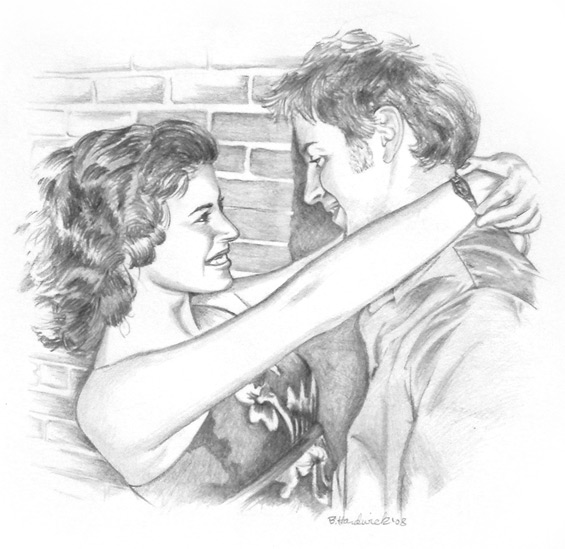
Personal Art
I drew this as a Christmas present for my fiance. I guess she liked it because it’s now hanging over the mantle.
Hardwick Farms
A Lakeland, Georgia-based blueberry farm approached me to design an identity for their brand. This farm, being relatively new to the market and located in a very rural area, needed a look that said, “We’ve been here for 100 years,” without actually being there for 100 years. I went for an old weathered sign look, starting with a clean, traditional design, then distressing it slightly. And if you’re wondering about the name, it’s no coincidence. The farmer is, in fact, my dad.
Save your Garbage Man!
I’ve just started working on a new project for Veolia Environmental Services, and it’s really interesting. It is a public awareness campaign targeted toward stopping garbage man fatalities. I was not aware of this, but 63 workers were killed last year in the US by motorists who were either on the phone or just not paying attention. The campaign will include print ads, billboards, bumper stickers and a facebook page. I’m also sketching some storyboards for a video which will appear on the page that will be shot in the style of a 1950s black and white instructional film. Stay posted for updates. I hope to be posting things soon!
ART & COPY Tonight!
From 6:30-9:00 this evening, 5 Points Theatre will be showing the film ART & COPY. If you’re interested in the world of advertising, or if you just want to understand those who live it and love it, be there tonight to hear from some of the top creatives in the field who explain what they’ve done, how they did it and what’s in store for the future.
Bryant Creates
I created this logo specifically for the website, but I’ll probably carry it over into other applications. Since I believe that advertising and design should speak to the intended viewer, then why not create a logo that does that… literally. The Y in my name also helped form the bottom of the speech bubble in a nice, clean way.
eCompliments
This was a contest entry for a compliments website. I had the opportunity to write and… um, star in this. It didn’t win, but everyone involved had a great time and enjoyed their payment in happy hour beers. Continue reading “eCompliments”
Christmas Card Photo Shoot!
For the past 10 or so years, I’ve had holiday pictures taken with my 3-foot-tall Christmas tree named Doug. I usually make them into cards and send it out to all of my closest friends. This year, Corey Grundsen from LastMinutePhotoStudio.com was able to make it by to document the event. Continue reading “Christmas Card Photo Shoot!”
First Federal Money Fairy
During its Dollars 4 Debts campaign, First Federal decided to take on a spokesperson in the form of the Money Fairy. At the time, it was still undecided if she would be portrayed by an actor or by illustration, and I mocked up these three pieces to give the client an idea of how she could look if illustrated. They ranged from a tighter sketch, to a looser sketch to… well, outright cartoony. In the end, they went with a real person, but I always liked how these turned out. Continue reading “First Federal Money Fairy”
Bodas de Sangre Poster
For the marquee poster of Bodas de Sangre (The Blood Wedding), I decided on a pulp novel look mixed with a three color palette of dull colors to assist the aged look. Each part of this poster tells part of a story from this Spanish opera, and the play information is crafted into a modular bar along the bottom. Continue reading “Bodas de Sangre Poster”
Winn-Dixie
It was a great opportunity to dive into some of the storyboarding and writing for the newest Winn-Dixie spots. Not only was my task to create visuals for the client by making the words come alive, but I was also asked to fun up the scripts themselves. The jumping into shoes, weird dog hair and high-fives were among the ideas I threw in, and it was great to see them make it into the final product. I also concepted and created the initial chalkboard end tags. Continue reading “Winn-Dixie”
Album Artwork
Being a huge fan of music, I’ve been making mixes of my favorite stuff for years. And instead of continuing to bore my friends with useless band knowledge, I now let them judge for themselves with their very own tailored mixes. After a couple of years doing this, I can’t decide which I enjoy more, compiling the tunes, or designing the cover art. Continue reading “Album Artwork”
Yogaberry
The minimalist, split-screen approach for Yogaberry came together in an effort to brand this upstart yogurt shop as clean, smart and healthy. The simplistic look of the seven posters also helped give some exciting splashes of color to their laid back “gallery meets earth tones” styled store interior. Continue reading “Yogaberry”
Don’t miss Art Walk!
Jacksonville’s First Wednesday Downtown Art Walk will be held… well, Wednesday. It goes from 5-9 pm, rain or shine (the latter would be better). Hope to see you there! Click here for more information.
Catlin Product Contamination Insurance
This campaign was run in various insurance underwriter magazines to launch Catlin’s Product Contamination insurance. In order to stand out from the swarm of clutter, this quarter-page ad needed to shock and awe. So what does it better than a rat in a bottle? According to the client, this ad got an infestation of calls and pellets of controversy. If their goal was to stand out from the pack and introduce this product with a bang, I say mission accomplished. Continue reading “Catlin Product Contamination Insurance”
Empty Bowls
Feelin’ kind of… abstract? Second Harvest Food Back needed a logo for their Empty Bowls program. Honestly, for this one I had a picture in my head while I was at lunch one day and immediately scribbled on a napkin. It kind of reminds me of an Etch-a-Sketch drawing. Continue reading “Empty Bowls”
Back to the Garden
In this web layout, you get to see the Back to the Garden logo in action. This original concept focused more on the sustainable garden, sending the idea of green housing a little more into the background. The reason for this was that although green housing is very important, it’s not original to the environmentally-conscious residents of Albuquerque, NM. The organic garden which supplied its home owners with their weekly vegetables was definitely a new and unique concept.
Halifax Health-Hospice
Halifax Health-Hospice of Volusia/Flagler advertises in half a dozen health care publications and needed a look that would set them apart from the competition in a heavily saturated Daytona market. After exploring a number of concepts, the client chose the “storybook” look. Continue reading “Halifax Health-Hospice”
Chipola River Club Clock
When you’re trying to sell million-dollar plots of land near Tallahassee to wealthy hunting enthusiasts, you probably need more than a traditional mailer to get their attention. This idea came about when I was flipping through Continue reading “Chipola River Club Clock”
Carolina Clean
This pro bono logo was for a window cleaning company located in Charleston, South Carolina. I went for a look that would read well on a variety of platforms such as uniforms, vehicle wraps, television spots, business cards and flyers.
Teatro Nuevo México
After illustrating several original marquee posters for this Albuquerque-based, Spanish opera house, I was delighted when they asked me to design a schedule booklet for all of the season’s shows. I wanted to build a showcase piece small enough for a theater patron to hold with a program, but large enough to display the illustrations and information. I was happy with how this booklet turned out, and even happier when it won an Addy! Continue reading “Teatro Nuevo México”
Back to the Garden
When an Albuquerque-based developer wants to market its new concept of 1,000 green homes surrounding and organic farm that delivers fresh vegetables to its residents each week, what is the logo supposed to look like? Simple. You make it look, well, simple. Continue reading “Back to the Garden”
Zarzuela Series Posters
I had the opportunity to design quite a few marquee posters for a Spanish opera house. The client was very open to my ideas and only had one requirement for this particular series: a wrought iron border. Done! The rest of it was the result of multiple readings of the plays, dozens of sketches and the combined contributions of my good friends Illustrator and Photoshop. These posters also helped pull in three Addys in the categories of Poster Campaign, Illustration and Brochure Design. Continue reading “Zarzuela Series Posters”
Catlin Arctic Survey
I felt that this Arctic expedition needed to show a couple of things graphically. One was that the conditions are harsh, so I wanted the viewer to feel like they were there in the moment by showing a cold, yet grungy look. The second was that since this was going to be a well documented trip, I threw in the old-school film effect. It seemed to mesh well with the theme, while allowing for multiple images to be displayed.
Creagra
Although I didn’t write this spoof commercial for the Addy Awards ceremony, it was my advertising community acting debut. For wardrobe, I had to go no further than my personal closet. That’s right, those threads are keepers! Continue reading “Creagra”
Hello interwebbers!
Welcome to my site. If you’re noticing a lack of work here, it’s because I’m still building it. But take a look around if you like. Otherwise, check back in a week or so. It should look much better by then. Thanks!