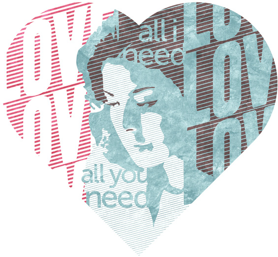
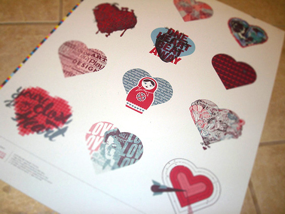
AIGA Jacksonville recently asked me to join 11 other members in interpreting the symbol most synonymous with love (the heart) for the 2012 I Love Design poster project. I was incredibly flattered that I was invited to participate, and the following is the write-up that I submitted with my entry: At the ripe young age of 37, I found myself a newlywed. When asked to define love in a heart-shaped box, I immediately thought of my wife. And did I mention The Beatles? I really, really love me some Beatles. If I’m not listening to them, I’m seeking out music heavily influenced by them, co-written by them or even vaguely reminiscent of them. So it seemed only fitting to combine my love for Kat with that of what I consider to be the greatest and most influential band in musical history. I give you… All I Need is Kat (and The Beatles).
Category: Illustration
Always Summer… Circa 1967
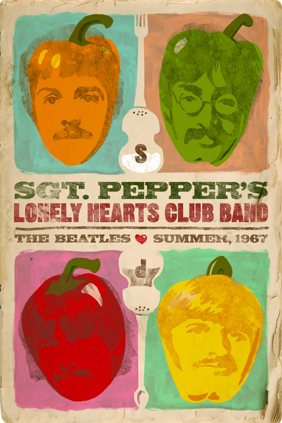
AIGA’s Always Summer poster show is a prime display of the creative excellence of Northeast Florida’s greatest design minds. The premise is simple. Design a poster of any size, in any medium, referencing a song that reminds you of summer. It’s a great exercise to brush out the cobwebs and create without limits. My entry just happened to celebrate a summer that happened before I was born. It’s of particular note to me because it’s when one of my favorite Beatles albums was released. Where I went a little different with it, though, was in how I portrayed the Fab Four: as actual peppers. To round out the food theme, the salt & pepper/fork & spoon combinations formed the shapes of Paul McCartney’s Hofner bass guitar.
Save the Date!
Since the venue for our wedding is the historic 5 Points Theatre, I thought it would be fun to go retro with the Save the Date cards. After borrowing from the feel of old movie posters for the front and infusing a little Hatch Show Print-inspired rock n’ roll poster for the back, this came together nicely. Continue reading “Save the Date!”
Imagination Squared
Imagination Squared is an initiative to show Jacksonville’s creativity and commitment to the arts in education and in life. These small squares (about 1,000) will be assembled into a giant mural to be displayed in Jacksonville’s Museum of Contemporary Art. Now I know it’s only a 5×5 inch square, but my big challenge was what to actually put in this thing. Being a music lover, my mind immediately went to my two biggest inspirations… Elvis and the Beatles. Continue reading “Imagination Squared”
The Outback Croc
As part of a pitch to Outback Steakhouse, I was tasked with creating a simple crocodile character for use in web and television commercials. After inking the croc, I printed him, crumpled him, photographed him, loosely clipped him out, then placed him on a CG background. Oh yeah, I experimented… and love the finished result. Below you will find one of the earlier crocs (more Gary Larson-looking) that I explored along the way. Continue reading “The Outback Croc”
Einstein Bros. Bagels
When incorporating illustration into design, I like to go the way of clean and simple. And what is simpler than crayons? Over a few new business pitches, I have found that Mr. Crayola has been my “best bud” while giving life to inanimate objects. In this case, the objects were Einstein Bros. bagels. Some had muscles, some were knives and some could fly! But in this case, drawing with crayons was never more delicious. Continue reading “Einstein Bros. Bagels”
Personal Art
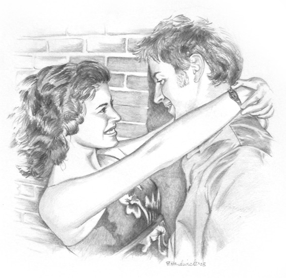
I drew this as a Christmas present for my fiance. I guess she liked it because it’s now hanging over the mantle.
First Federal Money Fairy
During its Dollars 4 Debts campaign, First Federal decided to take on a spokesperson in the form of the Money Fairy. At the time, it was still undecided if she would be portrayed by an actor or by illustration, and I mocked up these three pieces to give the client an idea of how she could look if illustrated. They ranged from a tighter sketch, to a looser sketch to… well, outright cartoony. In the end, they went with a real person, but I always liked how these turned out. Continue reading “First Federal Money Fairy”
Bodas de Sangre Poster
For the marquee poster of Bodas de Sangre (The Blood Wedding), I decided on a pulp novel look mixed with a three color palette of dull colors to assist the aged look. Each part of this poster tells part of a story from this Spanish opera, and the play information is crafted into a modular bar along the bottom. Continue reading “Bodas de Sangre Poster”
Zarzuela Series Posters
I had the opportunity to design quite a few marquee posters for a Spanish opera house. The client was very open to my ideas and only had one requirement for this particular series: a wrought iron border. Done! The rest of it was the result of multiple readings of the plays, dozens of sketches and the combined contributions of my good friends Illustrator and Photoshop. These posters also helped pull in three Addys in the categories of Poster Campaign, Illustration and Brochure Design. Continue reading “Zarzuela Series Posters”