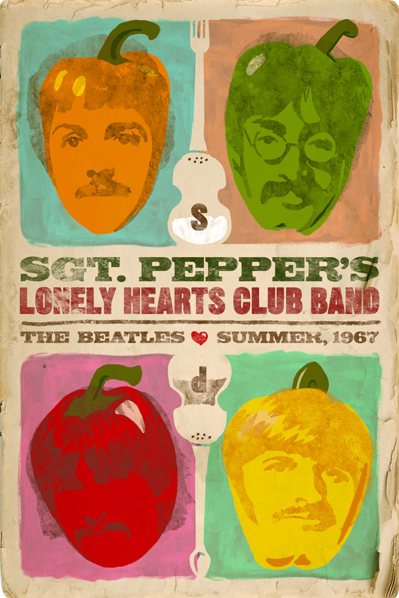
Always Summer… Circa 1967

AIGA’s Always Summer poster show is a prime display of the creative excellence of Northeast Florida’s greatest design minds. The premise is simple. Design a poster of any size, in any medium, referencing a song that reminds you of summer. It’s a great exercise to brush out the cobwebs and create without limits. My entry just happened to celebrate a summer that happened before I was born. It’s of particular note to me because it’s when one of my favorite Beatles albums was released. Where I went a little different with it, though, was in how I portrayed the Fab Four: as actual peppers. To round out the food theme, the salt & pepper/fork & spoon combinations formed the shapes of Paul McCartney’s Hofner bass guitar.

Greater Jacksonville Fair

When I sat down with the Greater Jacksonville Fair to discuss revamping their look, I felt a little embarrassed that I couldn’t remember seeing any of their materials in the past few years. This shocked them since yearly they promote on more than 50 local billboards and distribute print materials to hundreds of area businesses. For me, the mission became clear. Make the message simple. Make the graphics bold. Make the people remember it! Continue reading “Greater Jacksonville Fair”

Dundee Hills

In a time when the Napa Valley more closely resembles a theme park than laid back wine country, there are other wine regions in the west that provide the authentic and tranquil Napa experience made popular in the 1970s. These double truck ads feature an illustrated coastline and map from Napa to Portland, great photography of rich Oregon wine country and cheeky call-outs such as “No busloads of tourists here,” and “No $30 tasting pours here.” Continue reading “Dundee Hills”

Eleets Transportation

When you’re in the whirlwind known as the RFP, sometimes it seems like there is little time for anything other than getting the package out on deadline. But then there are times when things just seem to fall into place, allowing you time to add a few finishing flourishes. On limited time and a more limited budget, I was able to concept and produce this fun RFP piece, which features a clean design, concealed wire binding, a blind embossed logo cover and a custom tab page for financials. Continue reading “Eleets Transportation”

Catlin Arctic Survey 2010

New year, new survey… new look? For the 2010 Catlin Arctic Survey, I went for a cleaner, more focused layout. The THIS IS campaign shows visuals of the scientists roughing it in the North Pole, while the headline pulls the relation back to Catlin and their dedication to insurance underwriting. This five-ad series ran in multiple business and insurance publications in the US and the UK. Continue reading “Catlin Arctic Survey 2010”

Catlin Product Contamination Insurance

This campaign was run in various insurance underwriter magazines to launch Catlin’s Product Contamination insurance. In order to stand out from the swarm of clutter, this quarter-page ad needed to shock and awe. So what does it better than a rat in a bottle? According to the client, this ad got an infestation of calls and pellets of controversy. If their goal was to stand out from the pack and introduce this product with a bang, I say mission accomplished. Continue reading “Catlin Product Contamination Insurance”

Teatro Nuevo México

After illustrating several original marquee posters for this Albuquerque-based, Spanish opera house, I was delighted when they asked me to design a schedule booklet for all of the season’s shows. I wanted to build a showcase piece small enough for a theater patron to hold with a program, but large enough to display the illustrations and information. I was happy with how this booklet turned out, and even happier when it won an Addy! Continue reading “Teatro Nuevo México”

Catlin Arctic Survey

I felt that this Arctic expedition needed to show a couple of things graphically. One was that the conditions are harsh, so I wanted the viewer to feel like they were there in the moment by showing a cold, yet grungy look. The second was that since this was going to be a well documented trip, I threw in the old-school film effect. It seemed to mesh well with the theme, while allowing for multiple images to be displayed.